Hello together,
I have asked another question about pylinac, but maybe it’s more structured when I open an own topic for this question. But I have asked it in the original thread as well.
The most important question to me is:
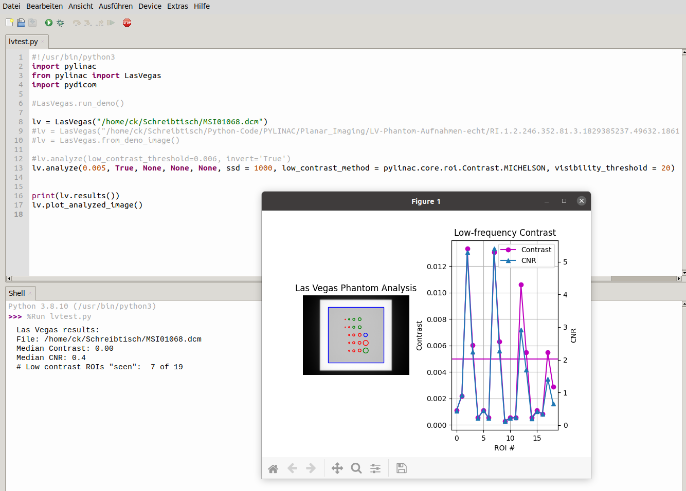
How does pylinac count ROI in the planar imaging module with the las vegas phantom?
There are 7 ROI “seen” and there are 7 ROI above the violet line in the graphic which represents my threshold - but which ROI in the right side of the plot of the analyze-method represent which ROI in the actual dicom-picture?
And why are there 7 out of 19 ROI seen but 20 (not 19) ROI are highlighted in the colored graphic on the left side of the plot?
I really don’t get the connection between the real dicom-image and the graph on the right side or the graphic on the left side of the plot of the analyze-method.
I just want to know which ROI are seen and maybe color just this ROI green in the graphic.
Maybe I don’t see the forest for the trees…
ANY help is appreciated. Attached a screenshot for better understanding.
Thanks a lot